The hard rule of padding..?
"Left, check, right, check
Oh wait, the vertical padding is smaller than the one horizontally, let me fix that..."
In the designer world, we overthink uniform consistency as a way to create perfect, well, pleasant design for the eyes to look at.
So, we make things uniformly the same as each other, for instance, some think horizontal and vertical padding should always be the same - if we set y to 8px, then x should be 8px too. This sounds fair, in fact, some people believe there are hard rules for padding and spacing, but honestly, not really.
Padding is often used to increase the white space surrounding an element, to make things less packed as it is, or to separate one element from the rest.
We don't want to make paragraphs of information be displayed like a pack of sardines - that would be horrible to look at and it would be easy for us to get distracted by surrounding elements instead. However, an odd amount of white space would easily turn your design into something bland and create fatigue for the users.
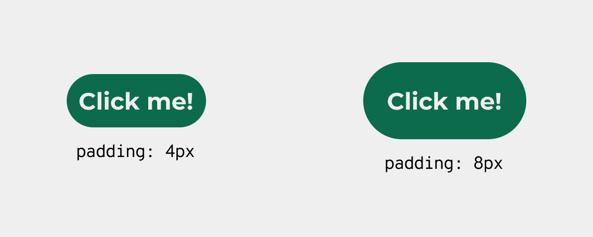
Now, imagine this, you designed a pill-shaped button and you decided to give it some extra white space. You added 4px to the vertical axis, so obviously you would apply the same to the horziontal axis as well, but, it looks kinda off...
 Oh, uhm, the
 4px one looks very crowded, but adding more white space makes the button look too spacious...
Despite being uniformally consistent in a scientific matter, the two buttons above still do not look right, one is too packed and does not create enough visual to let user know this is a different element. On the other hand, the 8px padding one has more white space, but the visual result seems off, like optically, the horizontal padding does not equal to the vertical ones.
Now, how about we ignore this "hard rule" and increase the padding on the horizontal axis only?
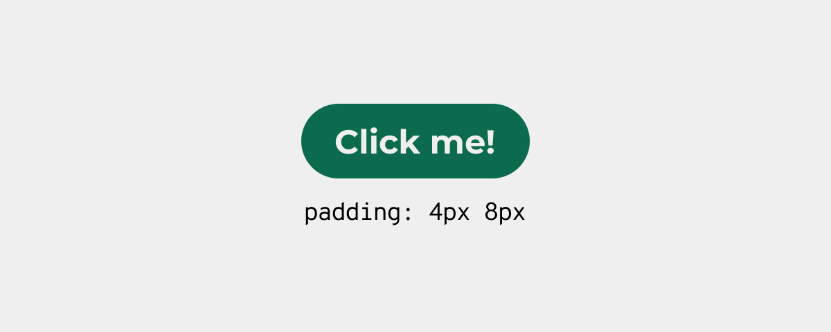 Well, this looks kinda nicer? Like, it's not too crowded, but it's not too spacious either
I know this sounds a bit absurd, like what I am saying above is very subjective rather than something unbiased and factual, but good design employs objectivity and subjectivity, there's really no hard rule for padding.
It's kinda late now, I have work tomorrow and explaining this properly is honestly a very difficult thing to do (for me at least!), but feelings do matter sometimes.
Cheers,
7kayoh